
The New Cacidi Charts, which are available as of RIGHT NOW!, has a huge number of new charts, added features like the new Callout function, and improved functionality. The new interface gives a lot of new functions, and a general huge lift in possibilities.

Now 10 different types of Charts!
Now the Expanded Pie chart, the Gauge chart, the Pyramid and High ‘n Low Chart, all new, and in addition to the Pie chart, the Circle chart, the Column chart, the Bar chart, the Area chart and the line ‘n Scatter chart, you already know..
Expanded Pie Chart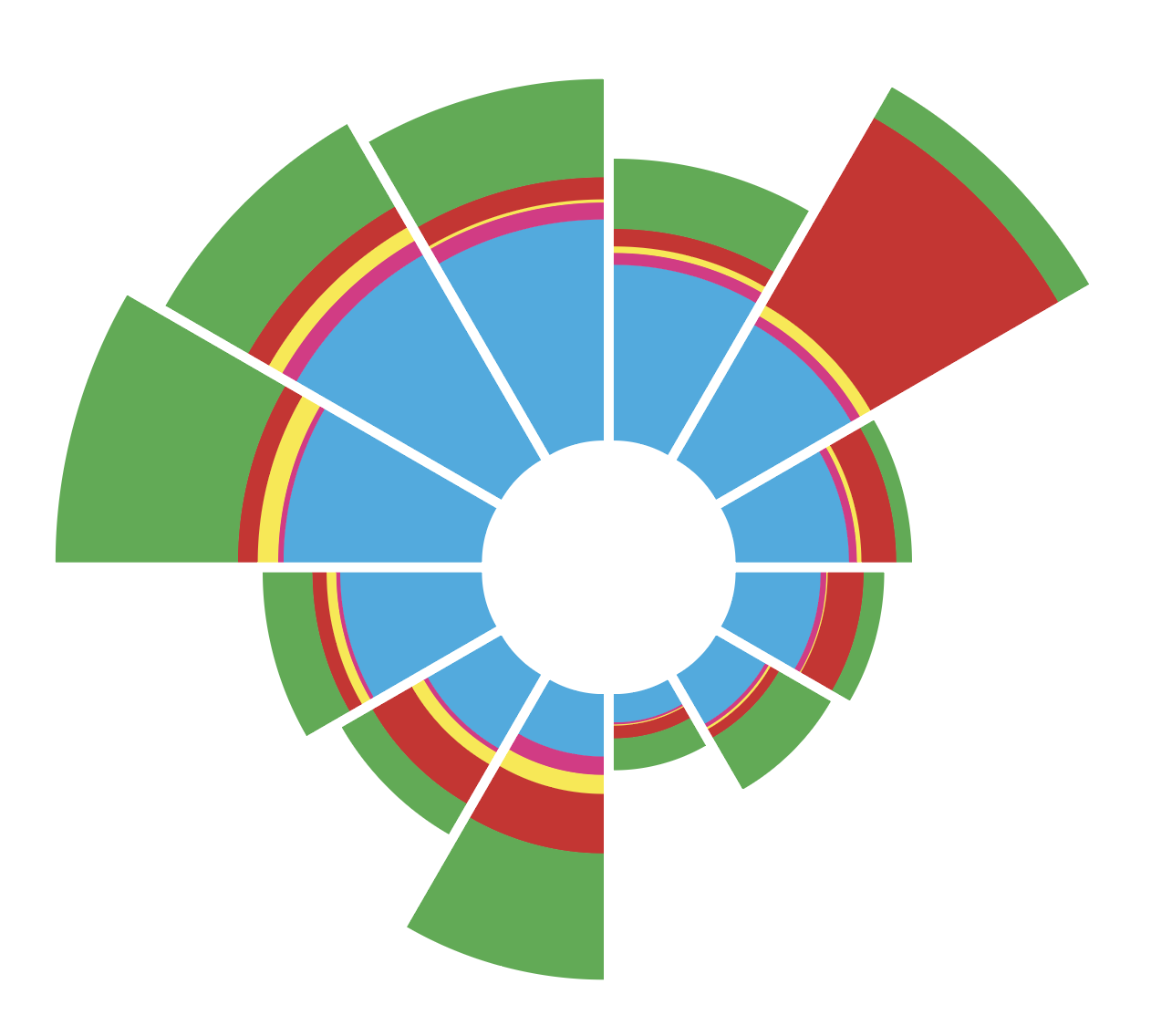
A chart when the footprint of the chart are the center of the chart, and the hight of the expanding columns are defined by the size of the value.. Very easy read for us human.
Gauge Chart
Trying to look a little like a gauge for pressure, a small arrow at the end make it easy to see the maximum of the values.. As an extra feature – a gray background graphic can be shown.
Pyramid Chart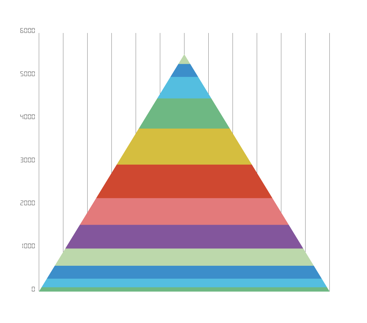
A pyramid shows 100% of the total values, each bar/column represent the procent max. value. Beautiful!
High and Low Chart
For stock brokers, must have chart! The chart are showing the open/close and the high and low value, for a given day.. represented with a bar with a background line.
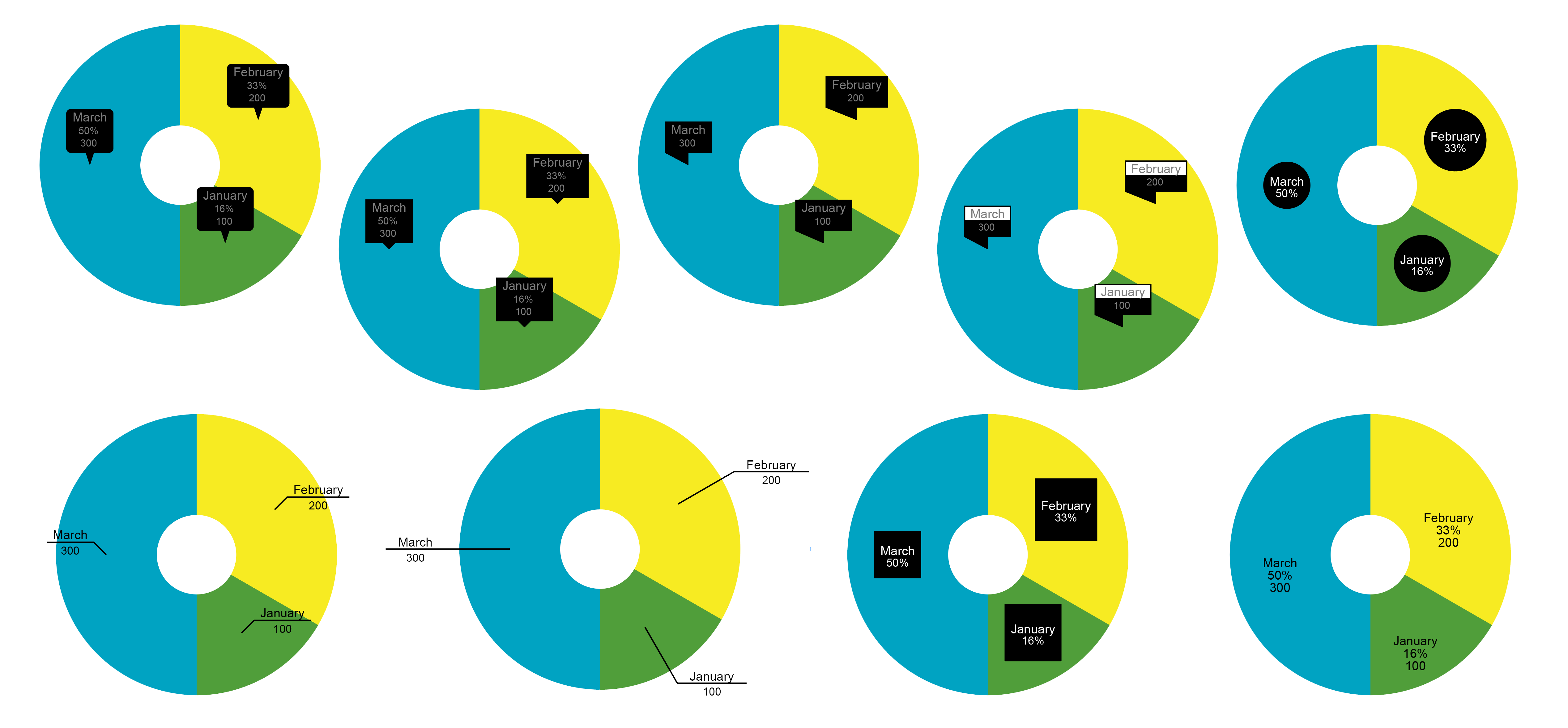
9 types of Callouts!
For displaying data there a now not just the regular x-axis/y-axis values, but also a huge range of signs, small graphics, that are displaying data like value, total or header..
Stacked Charts!
Almost any charts can have stacked data, meaning that the row data stacked (from all rows), are the total of the column. Any, except High/Low can use the stacked data function.
Rounded Values!
Beautiful numbers like 100, 200, 300, can now be chosen instead of exact numbers.. Our algorithm calculate nice rounded values, no mater if it’s large or small values.
Position of Legend
The new legend engine gives you Left, Right, Top or bottom position, and will also calculate how many lines the space can hold.
Display of rounded x/y-values or grid!
Just like the square charts e.g. column or bar charts, the rounded charts can now have grid and values displayed.