
Today we are releasing a brand new version of Cacidi Charts CC2018 for InDesign, that includes a totally new chart, and a lot of improvements.
The New Circle Charts, give a new dimension to presenting infographic. It’s a very nice circle shaped graphic but shows data like a column chart.. Minimum and maximum values can be set, and the Doughnut Hole, well knows from the Pie Charts, can be adjusted. The Space between lines can changed (even negativ values up to -50% can be entered)..

Illustration shows the change space between circle lines.

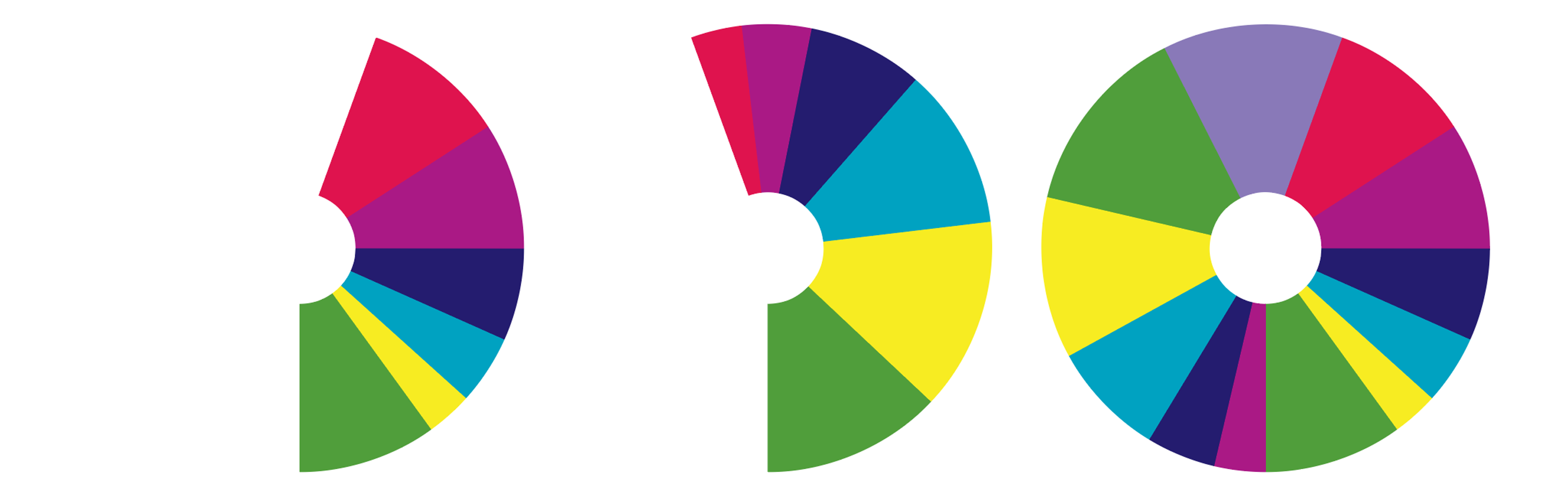
Illustration shows the change of the doughnut hole.
In addition to the new Circle Chart, we have added support for Minimum and Maximum Values for the Pie Chart.
The benefit of having the maximum values, in a pie chart, is to be able to create to e.g. two or more pie charts that can be compared. To use the Maximum values in a pie, the sum of all column in the row used for the Pie Chart must calculated. And to calculate the sum use the new fly-out menu point “Calculate Row Total”
The new plug-in for Adobe InDesign CC2018, can be downloaded from the download page starting today!